Red Hat Fuse Online API Driven Integration
We ventured into building integrations with API definitions, find out how we design the experience.

MY ROLE
User Research, UX/UI Design
TIMELINE
August 2018 - Present
TOOLS
Sketch, InVision
PLATFORM
Web-based application
As an effort to extend product capabilities, we introduced APIs as a construct of building integrations. The ability to build integrations with API definitions allows users to manage and scale their integrated applications and services more easily and efficiently. One of my recent design focuses is to design the user experience of building integrations with APIs.
This is an ongoing project and it has a unique set of challenges. I wanted to capture how I approach these challenges and what I learn along the way in this case study here.
Background
Basics vs. API driven integrations
The basic interaction model of building an integration in Fuse Online was pretty straightforward until we introduced APIs into the workflow. A simple integration needs a start connection which acts as a trigger and a finish connection which acts as a destination where data would travel to.
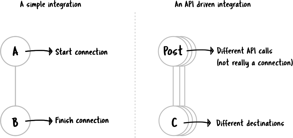
Letting users create an integration that starts with API calls brings complexity to the existing workflow as one integration could now contain multiple execution flows based on the operations defined in an API document. In other words, it means an integration may have multiple start “connections”.
Design goal
The goal was to design the user experience that enables users to create integrations that start with API calls.
The team
To provide some context, at the beginning of the project, there were two designers including myself embedded in the product team. The other designer moved on to another project after the first release and I stayed and led the design of the second release of this project. The product team consists of engineers (both backend and front-end), product manager, technical writer, and other stakeholders.
My role in this project was driving the early stage design exploration and delivering design for MVP for the first release, leading the usability testing and creating design solutions based on usability findings for the second release of the project.
Design
Design challenges
We faced a lot of unknowns at the beginning of the project since this was a whole new territory for us. After the project kick-off meeting, we had some clarity on requirements and expectations. From discussion with subject matter experts, we identified a few design challenges:
How might we help our users create an API driven integration?
How might we introduce the new concept of “flow” to our users?
How might we support easy navigation between different flows?

A sample API definition. Courtesy of Petstore Swagger. This demonstrates the amount of flows users potentially need to configure when bringing in an API definition to create an integration.
User workflow
(I worked with another designer for the first release of this feature, but I will only be showing my work here. )
Before diving into creating wireframes and high-fidelity designs, I started the project with identifying high-level user goals and tasks and mapping out the core user flows.
Having a good understanding of the user flow -
Helps me approach the design with more confidence and allowed me to understand how new requirements relate to the existing workflow.
Helps to communicate the design and build a sharing understanding among the group.
Allows me to break a larger design challenge into smaller and more approachable design questions.
Go broad, go narrow
Once we had a good understanding of the user workflow, we started exploring design concepts with blue-sky thinking. During this process, the other designer and I frequently met to discuss ideas and compare notes.
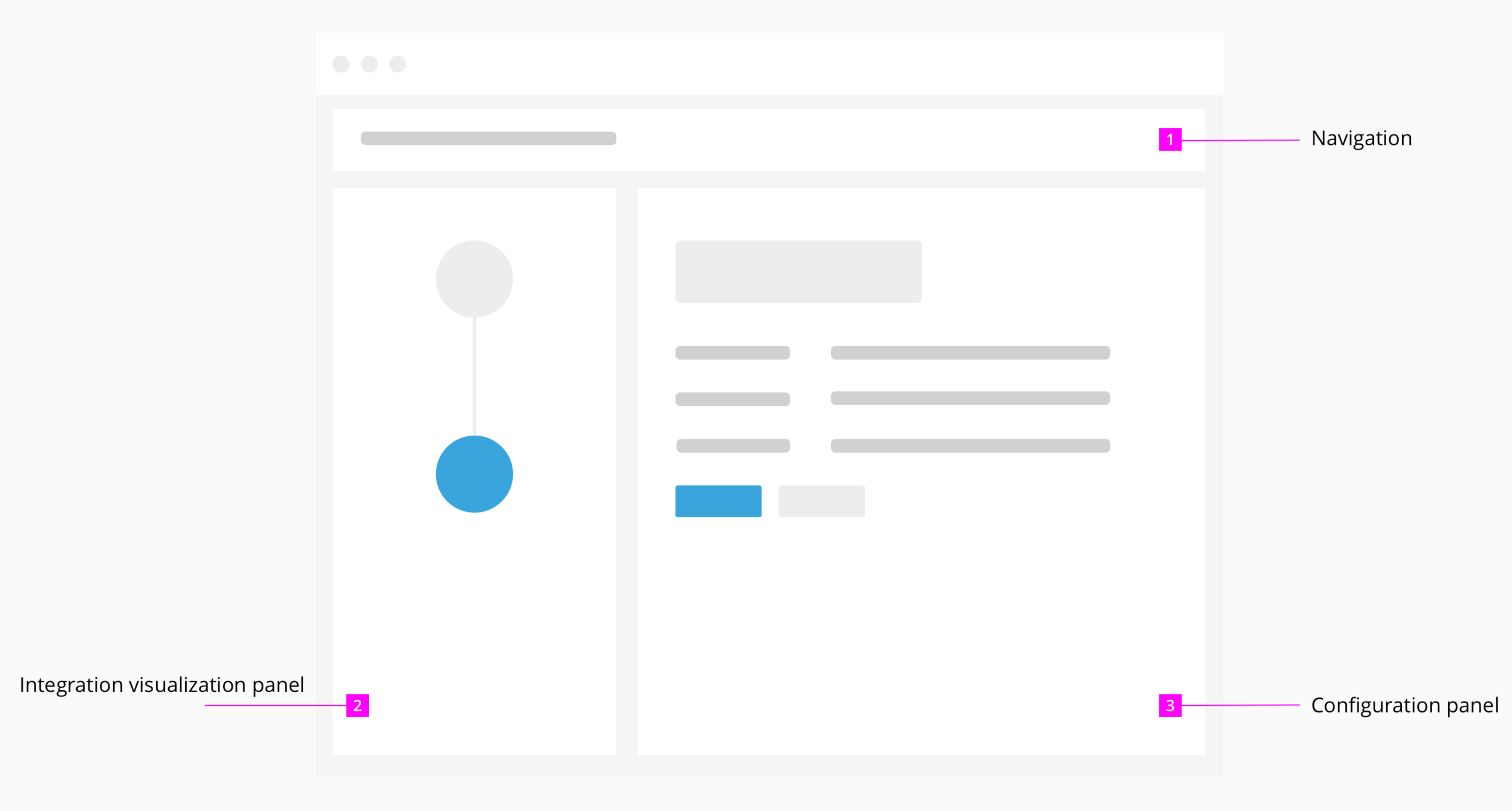
Above shows the basic page layout of the create integration workflow
How might users create an API driven integration?
I explored two options for helping users get started with an API driven integration.
Option A keeps the generic card view and users would use the filter to find the desired card.
Option B uses a collapse/expand concept and pre-group options by types for users.


How might we introduce to our users the new concept of “flow”?
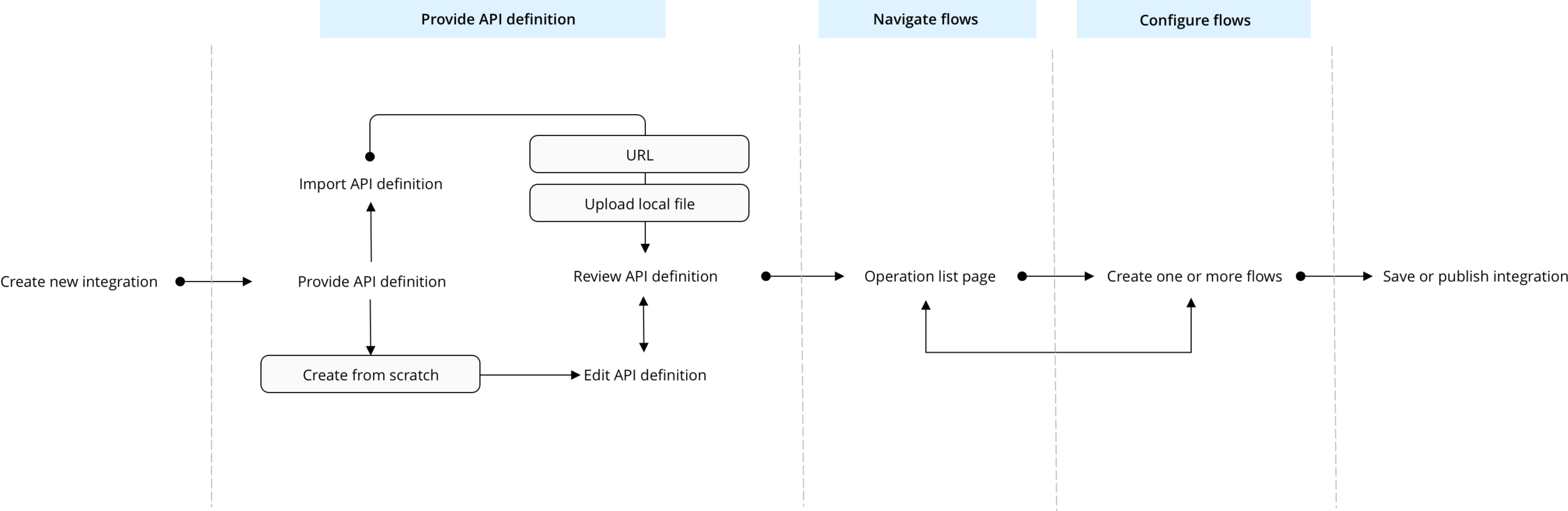
After providing an API definition, users are brought to a page called '“Operation list page” which we populate a list view with all the API operations that are defined in the API definition.
Each of the operation will act as a flow starter.
How might users navigate between different flows?
I decided to focus on allowing users to navigate between flows within the integration visualization panel, and explored different visualizations and interactions for that.
One of the options was to label the current flow with the operation name and it’s well received by stakeholders.
We learned from subject matter experts that an API definition could contain 20 - 80 operations, so I also focused the exploration on how to support easy and efficient navigation between flows.
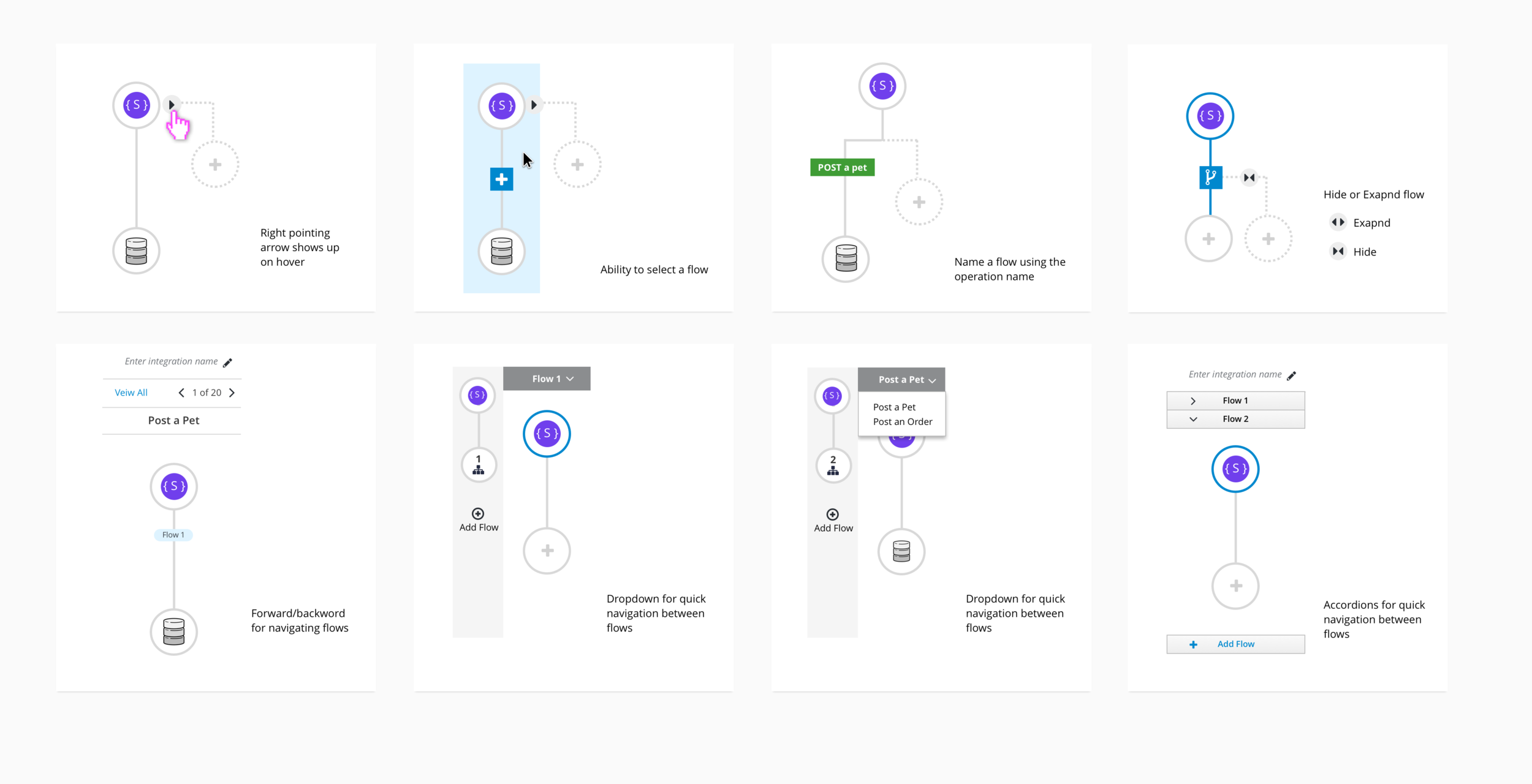
Exploration of flow visualization and interaction

Above shows a canvas view exploration for navigating between flows.
MVP for the first release
After a couple rounds of design explorations and design reviews, we decided to focus on making sure users were able to perform the basic tasks of building an API driven integration for the first release. The minimum set of requirements were defined and captured in the feature requirement GitHub issue.
We chose to go with option A to help users get started since pre-grouping the options would require a certain amount of rework of the existing back-end structure and it was out of scope for this feature.
We decided to move forward with the operation list page because that serves as a centralized hub for both navigation and retrieving information.
Although the concept of having a canvas view was well received by stakeholders, it would require too much effort for us to bring it in for the MVP version. The accordion and dropdown concepts both suffered from the lack of efficiency when supporting navigation of a long list of operations. In the end, we included a button in the navigation to help users get back to the operation list page.
For the complete workflow, see the MVP design posted to GitHub.

We included a visual in the IVP (left pane) to convey the idea of multiple flows.
Test and get feedback
After the first release of the feature, I conducted a usability testing with a couple internal participants to find out what the experience was like to create an API driven integration and identify areas for improvement.
Findings from the usability testing showed that -
We did great with the provide API definition part of the workflow as users were all able to complete the task. The guided workflow worked great!
The operation list looked too similar to the choose an action page (an existing page that also has a list view) and that confused the users.
Many users expressed the need of wanting to have constant access to the API definition once they provided that in the first part of the workflow.
The visual we included in the IVP does not work as expected because users thought it was interactive and kept wanting to click on it.
More design iteration for the second release
To address the issues that users ran into during the usability testing, I did more design iterations.
Improve the operation list view so it resembles visual similarity to a commonly used API document.
Included a link that is constantly accessible during the entire API integration workflow so users can have that constant access to the API document.
Reconstruct the layout of the flow creation pages to provide clearer information hierarchy and visual flow.
For the complete workflow, see the design updates posted to GitHub.

Results
Final words and next steps
The feature has now gone through its second release cycle, and we have received positive feedback about the improved UX. We are still actively trying to learn and get feedback from users so we can improve the offering.
By undertaking the effort to explore introducing multiple flows, with the lessons learned along the way, we are now in the process to look into bringing in conditional flow creation to our application.
Project learning
From a project management level, we had three major challenges:
Tight deadline. To make sure we meet the quarterly release schedule, we had a limited time to research and understand the design problem and create design solutions.
Feature complexity. Based on the initial discussion, it was made clear to us that the existing interaction model did not fit the new business requirements and we were bound to change the existing model and introduce new ones.
A lot of unknowns. Because the complexity, engineering would need to conduct some proof of concept (PoC) work to determine the feasibility of bringing this feature live in the given time frame. And because of the tight timeline, design needs to happen in parallel of engineering discovery work.
To tackle these challenges, we came up with three main strategies:
Pair design to divide and conquer. We had two designers working on this project during the initial design discovery phase. The goal was to create a few blue-sky design concepts to help us explore design possibilities then narrow down on design directions.
Identify MVP requirements. Once we had built a shared understanding of the design direction and technical feasibility, we worked the stakeholders to identify the MVP requirements for this feature. This helped guide us in design reviews and make sound design decisions.
Collaborate closely. We collaborated very closely with our subject matter experts throughout the different phases of the project to ensure we always have a point of contact to ask questions, and to be able to get feedback more frequently.